Text Widget
The Text Widget allows you to enter text into your content.
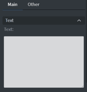
Properties > Widget > Main
Text
Type the text you want displayed into the text box.
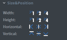
Size & Position
You can adjust the widget’s width, height, and position in the Size & Position menu.
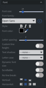
Font
From the Font Menu you can adjust the following settings:
- Font Size
- Font Family
- Style
- Color
- Letter Spacing
- Custom Line Height
- Text Shadow
- Letter Case
- Dynamic Font size: adjusts the font size based on the size of the widget
- Scrollable: makes the text scrollable
- No Line Break: removes line breaks
- Horizontal/Vertical Alignment
Proof of Play
Proof of play is a reporting system that allows you to gain reports about used assets. If you turn on widget statistics, you can report information about the displayed duration, number of displays, and interaction events of this widget. If you turn on asset statistics, you can report information about the displayed duration, number of displays, and events of each media asset inside this widget.
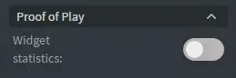
Image Properties Other
Properties > Widget > Other
Effects
- Background: select an image to use as the background of the widget
- BG Color: Select the background color of the widget
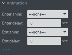
Animation
From the Animation Menu, you can set the entrance, exit, and repeat animation.
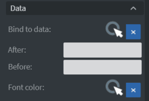
Bind to Data
Bind the widget to a datasource to automatically update the image.
- Bind to Data: Select the datasource
- Hide Based On: Hides the widget based on the datasource
- BG Color: change the background color based on the datasource
- Font Color: Use a datasource to select the font color
Translation
In the Translation Menu, the widget’s value may also change if the content’s language is altered, for instance, through a sensor or touch event.
Interaction
Use the Interaction Menu to choose the interaction type, Touch events, and event name and value.
Additional Properties
Select the three-dot menu below the Interaction option to show Additional Properties.
- Custom Margin: Set custom margins for the widget
- Shadow: Apply a shadow to the widget. This shadow is applied to the entire widget, not the text within the widget.
- Border: Adjust the border of the widget
- Opacity: Change the transparency of the widget
- Rounding: Round the edges of the widget
- Mask: use a PNG image file to affect the shape of the widget
- Flip: Flip the widget horizontally or vertically