Clock Widget
With the Clock widget, you can add an analog or digital clock to your content.
The Clock Widget is located in the Basic section of the Widgets.
Clock Properties
Main Properties Menu
Properties > Widget > Main
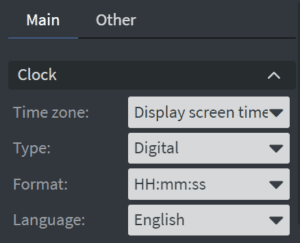
Clock:
You can adjust the Time Zone and Type properties from the Main Clock Properties section. For digital clocks, you can also select different time formats and languages. These options are not available for the analog clock type.
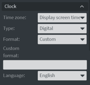
Custom Format:
Choose Custom from the Format dropdown to use a custom time format. When Custom is selected, a Custom Format field will appear, and you can enter the custom format.
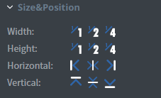
Size & Position
Select the width, height, and placement from the Size & Position menu. Learn more about the Size & Position menu.
Proof of Play
Proof of Play is a reporting system that lets you report how often assets are played.
Other Properties Menu
Properties > Widgets > Other
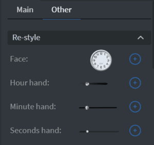
Re-Style
If you have selected the Analog Clock, you can choose from different clock faces and hands or add your own custom face or hands.
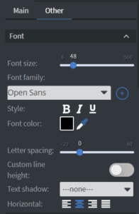
Font
If you have selected the Digital Clock, you can adjust Font settings such as the size, font family, style, and color. You can also set the letter spacing and text-shadow.
 .
.
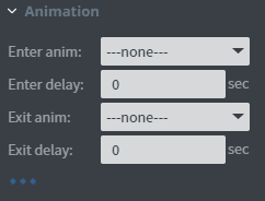
Animation
In the Animation Menu, you can add entrance and exit animation to the widget.
Additional Properties
Under the Animation Menu, is a three-dot menu which expands to provide additional properties.
- Custom Margin: set custom margins for the widget
- Shadow: add shadow to the widget
- Border: Add a border to the widget
- Opacity: adjust the opacity
- Rounding: round the edges of the widget
- Mask: allows you to select a .png image to affect the shape of the widget
- Flip: flip the widget horizontally or vertically
- Click Through: allows you to click through the widget and interact with widgets underneath
- Hide based on: uses a datasource binding to determine the visibility of the widget